Box Model
All the elements in the HTML are displayed as boxes with default properties associated with them. This is what we referred to Box Model in CSS.
A box model contains :
- Content box:
This is the area where your content is displayed, which can be sized using properties width and height. - Padding box:
This sits around the content, its size can be confrolled using padding property. - Border box:
This wrap around the content and padding. Its size and style can be controlled using border property. - Margin box ( this is invisable from the HTML page) :
This is the outermost layer, wrapping the content, padding and border as whitespace between this box and other elements. Its size can be controlled using margin property.
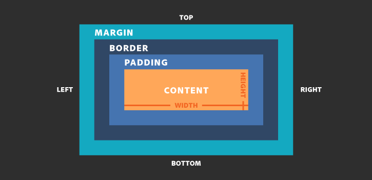
From above Box Model, the relative positions are easy to be recognized.
There are two kind of CSS box models:
-
The Standard CSS Box Model
By default, Standard CSS Box Model is used.
When you define the width and the height attributes, these 2 attributes define the width and height of context box, as shown in the image. for example:
` .box { width: 350px; height: 150px; } `The width and height defines the content box size. If you add the padding and broder, so the total visiable occupied area is :
width: content width + right padding + left padding + right border size + left border size.
height: content height + top padding + bottom padding + top border size + bottom border size.
So the total size that displays on the page is bigger than you defined in the .box.
-
The Alternative CSS Box Model

  .box {
       box-sizing : border-box;
           width: 350px;
           height: 150px;
      }
First, you need to declare the box-sizing: border-box ; to use the alternative CSS Box model. Therefor the width, and height you define will cover up to the outer of broder box.
Tip: if you want all of your elements to use the alternative box model,
set the box-sizing to html element, then set all other elements to inherit that value. Please see the following:
html {
   box-sizing: border-box;
	 }

	 *, *::before, *::after {
	     box-sizing: inherit;
		}
In CSS, there are two types of boxes:
- Block Box
- The box always starts on a new line and takes up the full width avaliable (stretchs out to the left and right).
- The width and height properties can be reassigned.
- Padding, margin and border will cause other elmeents to be pushed asway from the box.
Block level element in HTML:
<address>, <article>, <aside>, <blockquote>, <canvas>  <dd> <div>
      <dl> <dt> <fieldset> <figcaption> <figure> <footer> <form> <h1> - <h6> <header> <hr> <li> <main> <nav>
      <noscript> <ol> <p> <pre> <section> <table> <tfoot> <ul> <video>
- Inline Box:
- The box dose not start on a new line, and only taks up as much width as necessary.
- The width, and hieight properties will not apply.
- Vertical padding, margins, and borders will apply but will not cause other inline boxes to move away from the box.
- Horizontal padding, margins, and borders will apply and will cause other inline boxes to move away from the box.
Inline elements in HTML:
<a> <abbr> <acronym> <b> <bdo> <big> <br> <button> <cite> <code> <dfn> <em> <i> <img> <input>  <kbd>
       <label> <map> <object> <output> <q> <samp> <script> <select> <small> <span> <strong> <sub> <sup>
       <textarea> <time> <tt> <var>
Reminder: `<br>` is inline element, and it present as a new line character.
If you are intereted in how each element working, please refer to HTML Block and Inline Elemets
Display Types
For the box model, there two display types:
- outer display type:
This is to determine whether the box is going to be displayed as block or inline. - inner display tyep:
This is to determine the elements inside the box are laid out in normal flow (i.e. either block or inline) or using display proprty to change elements display type other than block and inline. i.e. flex, grid, etc…